Understanding the benchmarking graphs
Benchmarking allows you to compare your feather loss scores to those of your peers.
There are four graphs on the AssureWel Benchmarking Tool focusing on two areas of feather loss: the head/neck and the back/vent. For each of the areas, there is a graph showing the percentage of birds with any feather loss (Score 1&2) and another showing moderate/severe feather loss (Score 2). The data used to generate the graphs is collected on Freedom Food and Soil Association farms during welfare outcome assessments. All graphs are updated annually.
Each graph is split into 3 sections:
RED (bottom 25% of flocks), AMBER (middle 50% of flocks) and GREEN (best 25% of flocks). The thresholds for the different colours are based on pooled data from Freedom Food and Soil Association laying hen farms.
What colour your score falls into can help determine what action you should take:
- RED: Immediate action may be required to find the cause of the problem and put strategies in place to improve feather cover
- AMBER: You should plan for continuous improvement - aim for green
- GREEN: You have a higher performing flock, get in touch to share best practice, try self assessment and monitoring in your current and future flocks
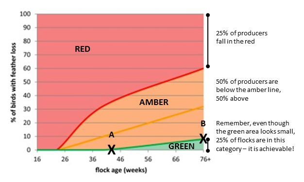
Example graph: total feather loss, head and neck (% score 1 + 2)
This graph shows feather loss increasing with age – however, the green area also demonstrates that flocks can and should be well feathered throughout their lives.
|
The graph shows ‘flock age’ along the x-axis and ‘% of birds affected by feather loss’ on the y-axis.
Point A: up to around 44 weeks 25% of flocks are achieving no feather loss on the head and neck.
Point B: At 76 weeks 25% of producers are still achieving less than 8% head and neck feather loss in their flocks.
|
|